What’s a Concept?
All the parts of a design project, including the words, images, sounds, formats, media, and context, all need to come together as an effective whole which is referred to as a design concept.

An idea is when you use research or predetermined knowledge in a new way to solve a problem. This involves creative thinking. For example, if you need to cross a small river, you might have an idea to use a large tree branch as a bridge.
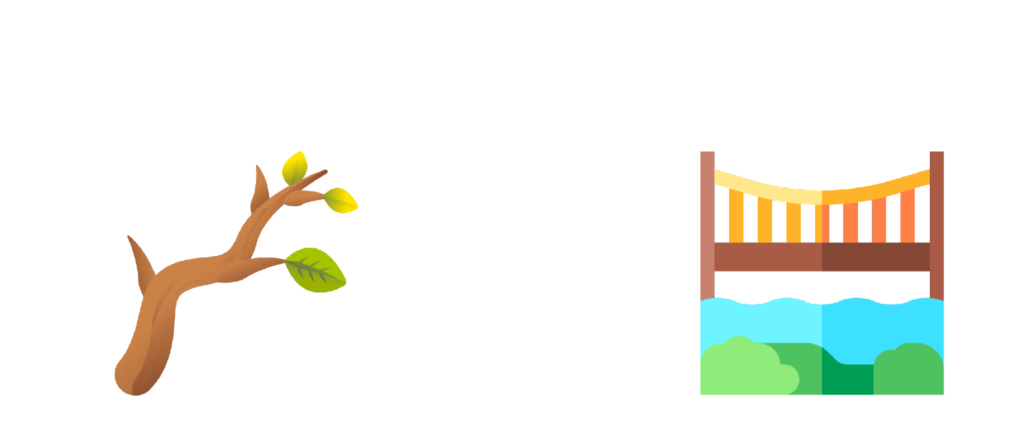
You can push an idea further by making an analogy, which is comparing two things on which the subject is based. In this case, you are making an analogy between the tree branch and a bridge because they both allow you to cross over the river.
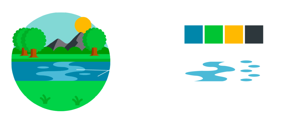
The form that a design takes on supports and helps communicate an idea or analogy. The form includes color, line, shape, or manner. For example, you may use blue in a design because it has a connection to the river. Form that is not connected to an idea becomes meaningless, but when form and idea integrate seamlessly, the design becomes a concept.
In design, an idea comes first, sparked by either an association, a mental connection, or a creative thought. There must be a reason for this idea, so always ask “why?” – Why should the poster be dark rather than bright? Why should I use this font? Why include this photography? When you can answer these questions, you can begin to give them form through shape and composition and begin to develop a full design concept, making the idea real.

Photo via Dezeen
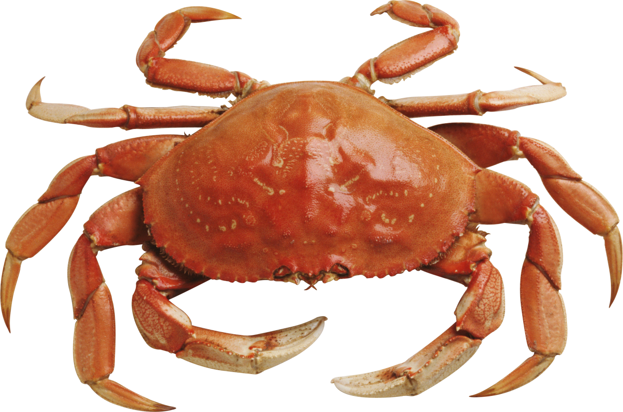
Architect Le Corbusier designed the Pilgrimage Chapel Notre-Dame-du-Haut at Ronchamp with the inspiration of a single animal: “the shell of a crab picked up on Long Island in 1946 [that is] lying on my drawing board. It will become the roof of the chapel.” And it did! Le Corbusier made an analogy between the shell of a crab and the roof of a house, and how they both provide protection to the inside from outside elements, and he ran with this idea and created a concept out of it.
This teaches us that as a designer, we must learn to see. We must learn to see interesting shapes, colors, textures, and compositions found in everything from movies, TV, books, paintings, architecture, and more. Design isn’t just about studying design, it’s about studying the world. You never know where a good idea will come from, but if you are open to the world around you then you will always have a storehouse of ideas to pick from.
Metaphoric Concepts
While an analogy is used to compare two similar things, such as a book being like a doorway to another world, a metaphor uses one thing to substitute for another very different thing, like the book becoming a doorway itself. Using a metaphor rather than an analogy helps explain the meaning of your idea and encourages you to look at something in a new way.
Designers often use visual metaphors in their projects, substituting one things for another based on a resemblance of either form, function, or meaning. When one image is used in place of another, the new context of the image creates a different interpretation of its meaning. Visual metaphors can add an element of surprise or shock but ultimately creates interest in the message.
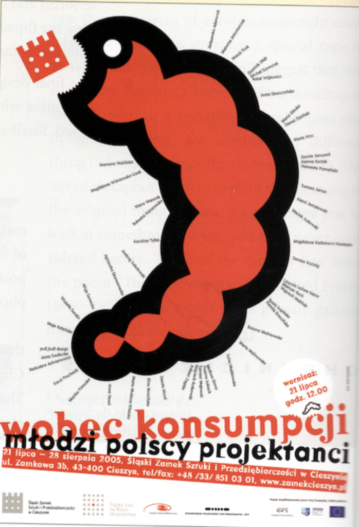
Photo via Guide to Graphic Design, Scott Santoro 2014
Kuba Sowinski’s Dealing with Consumption shows how a tiny worm can be used as a metaphor for consumption in a Speakout on Polish Poster design.

Photo via Amazon
The cover for The History of Western Philsophy by Betrand Russel was reworked by a metaphor. Paul Sahre, the designer of the cover, could have gone the safe route and used Renaissance oil painting that spoke of history and western civilization. Instead, he depicts western philosophy as a lonely, winding road, with a simple but effective result.
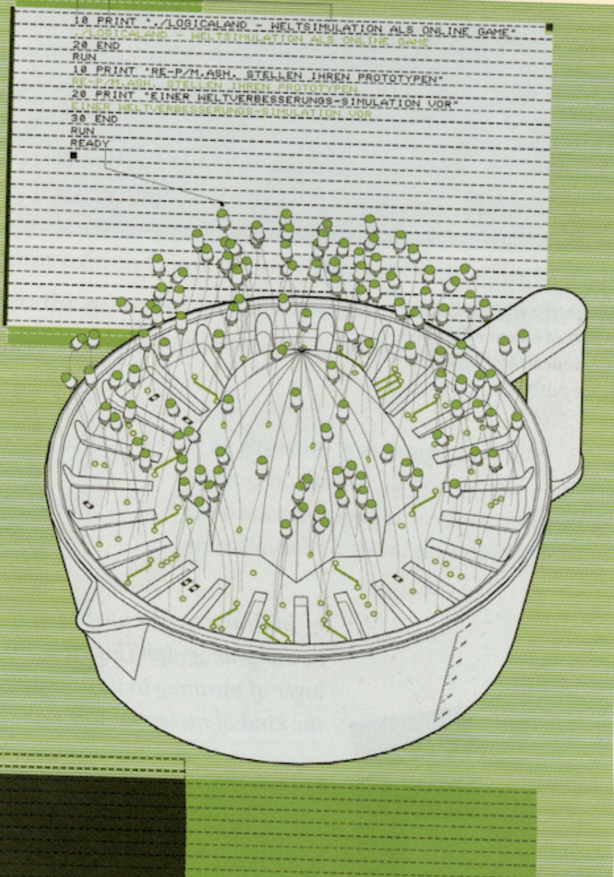
Photo via Guide to Graphic Design, Scott Santoro 2014
The Logicaland card invitation design by Martin Woodtli utilizes a juicer as its main element. Woodtli uses the juicer as a metaphor for resource division and exploitation, where the diodes represent game participants. It is odd and specific, but specialized for a niche audience.

Photo via University of Maryland Art Gallery
In this example, Tom Geismar uses a photo of a young person’s hand, palm facing forward, as a sign of friendship and peace. The hand represents humanity as a whole, it signifies caring for the future, and features hand-scrawled text at the bottom to further carry the message of the time period.
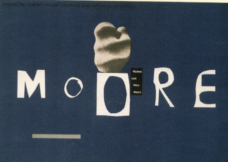
Photo via Guide to Graphic Design, Scott Santoro 2014
This poster created for Henry Moore’s exhibition in 1959 is reflective of his approach. Tomaszewski’s poster is simple in form, using only cut paper and one solid color, making him able to reflect the natural spirit of Moore’s sculptures.
Montage
A metaphoric concept can also be created by piecing together elements into a single image called a montage. A montage may look simple, but can be loaded with a surprising amount of depth. Designers will find images that don’t seem to belong together, but have a meaningful link, and this provides the glue that will generate a unique meaning.
Photos via Guide to Graphic Design, Scott Santoro 2014
In this case, students created montages as a part of a class exercise and used creative juxtapositions in compelling way to storytell.
Photo via Logo Design Love
Montages can also create memorable logos. This example combines the image of a clapboard with the letterform of an “F” combined into a single composition. The clapboard resembles the craft of directing, and the F feels solid and strong. Fusing the two elements results in a successful identity.
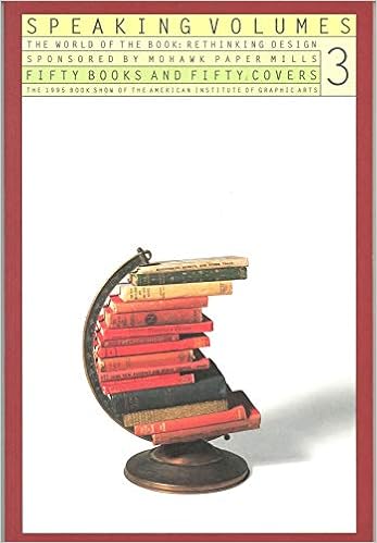
Photo via Amazon
Two images are combined on the cover of a brochure for Mohawk Fine Papers, Inc. The intriguing montage of books and a globe stand makes a compact combination that is itself a unique symbol. This case is very simple, yet extremely rich in meaning.

Photo via The New York Times Op-Ed
This example by Adam Palmer suggests puzzling US foreign policies, interconnectivity, and globalization. It captures an idea and tricks the eye into thinking that the forms work well together.
Montages are difficult to create, and designers will need to experiment with many combinations until the fused images sends a greater message than the parts would individually.
Analytic Concepts
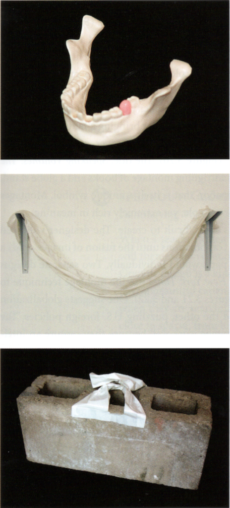
Just as metaphoric concepts rely on an audience recognizing an analogy, analytic concepts rely on the audience recognizing how relationships affect meaning. Analytic concepts juxtapose one thing with another to point out similarities, dissimilarities, and relationships. These projects “refer to” something rather than create a new meaning through an image. These concepts are more easily digested by audiences and are more direct than metaphoric concepts.
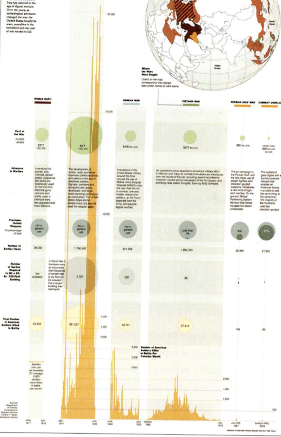
Photo via Guide to Graphic Design, Scott Santoro 2014
Analytic concepts are most often used in information design. Charts, graphs, and maps require analysis and structural organization of data. This example represents a system of interrelationships between technology, cost, and casualties of war. The visuals show the advance of technology and the fall of casualties and cost. The overlay of other forms makes this concept especially effective.
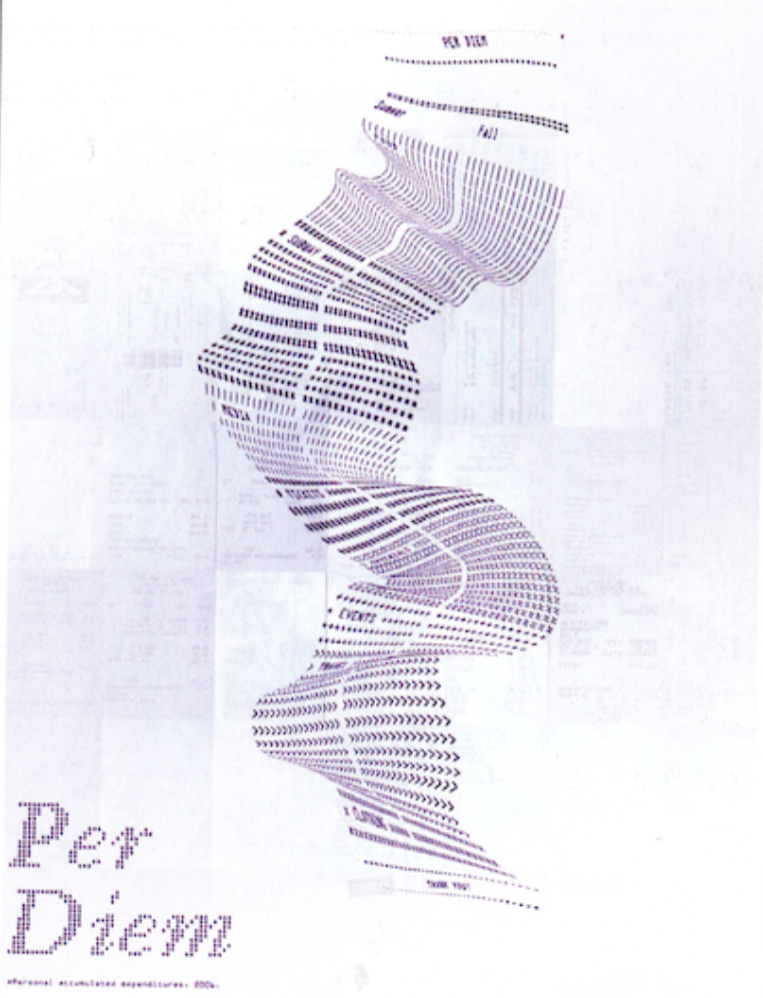
Photo via Guide to Graphic Design, Scott Santoro 2014
Per Diem uses a paper receipt as a structural elemtn to hold data. The term per diem refers to a daily allowance for living expenses while traveling. The shape morphs and bends to compare and contrast information.
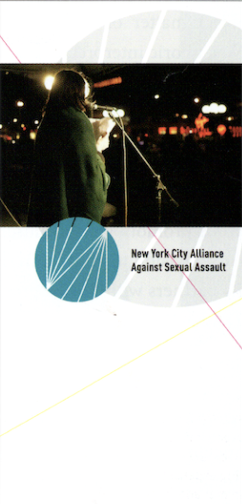
Photo via Guide to Graphic Design, Scott Santoro 2014
The visual identity of this brand uses a series of radiating lines in a solid circle to analytically represent the nonprofit group and their reach to hospitals, clinics, and help centers. The spirit of the identity is created by weaving the symbol, photography, and text into a unified composition.
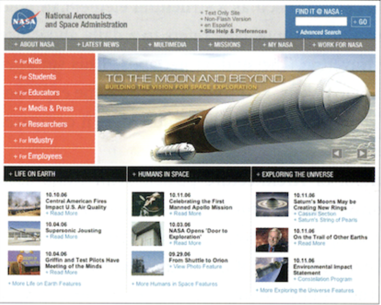
Photo via Guide to Graphic Design, Scott Santoro 2014
Websites often use analytic approaches because their nature is more navigational, and NASA is a good example of this. NASA’s website reflects the technology, observations, and facts of the subject matter, and the photographs and illustratons are examples of their space exploration. The website reflects NASA’s personality without being dull.
Meta Concepts
Meta concepts are when a design concept refers to itself or to a very specific audience. They are created to satisfy a design problem, but have an additional layer that is appealing to designers or other niche audiences. These concepts offer a visual conversation about the communication itself.

Photo via Tumblr
This poster shows a meta concept because they are intended to be pasted onto subway walls. Because of this, the posters are “pre-graffititied” celebrating the public, and sometimes illegal, act of self-expression. It also targets a young audience, one of prospective SVA students.
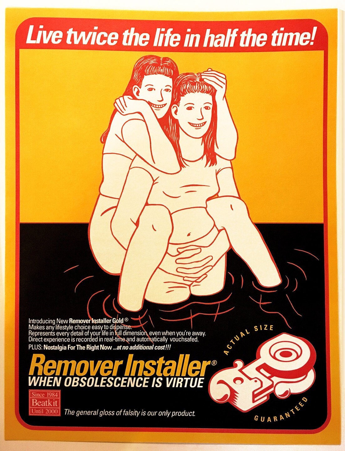
Photo via Etsy
Shawn Wolfe’s Beatkit shows a product that has no function and doesn’t actually exist. It is an anti-branding shenanigan that, according to Shawn, was meant “to harvest eyeballs long enough to force the otherwise complacent viewer to look closely and ask themselves… ‘is there anything in there?'” The goal isn’t to trick or berate, but rather to sharpen the eyes of the general public.
Multilayers
Design often uses a layering of conceptual approaches for effective communication, especially when there are complex solutions involved.
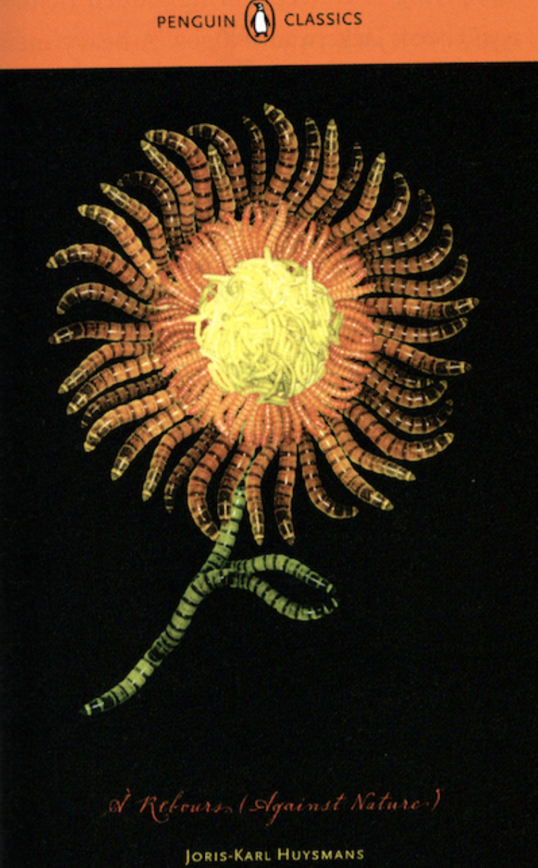
Photo via Guide to Graphic Design, Scott Santoro 2014
This cover design for Joris-Karl Huysmann focuses on the book’s time period (1884) by centering the elements and making the axis symmetrical, and the hand-script font is consistent with the concept of the past. The orange petals tie into the orange Penguin branding, and the flower represents an association with nature itself. However, upon closer inspection, the flower is created entirely out of maggots to signify decay, perfectly encapsulating the principle of the book.
Layering concepts brings more depth to design pieces. A metaphoric approach might be best suited for one project an analytical approach may be better for another, and a meta concept might be best for others. Bringing all of these together in certain ways may be the best solution all-around.
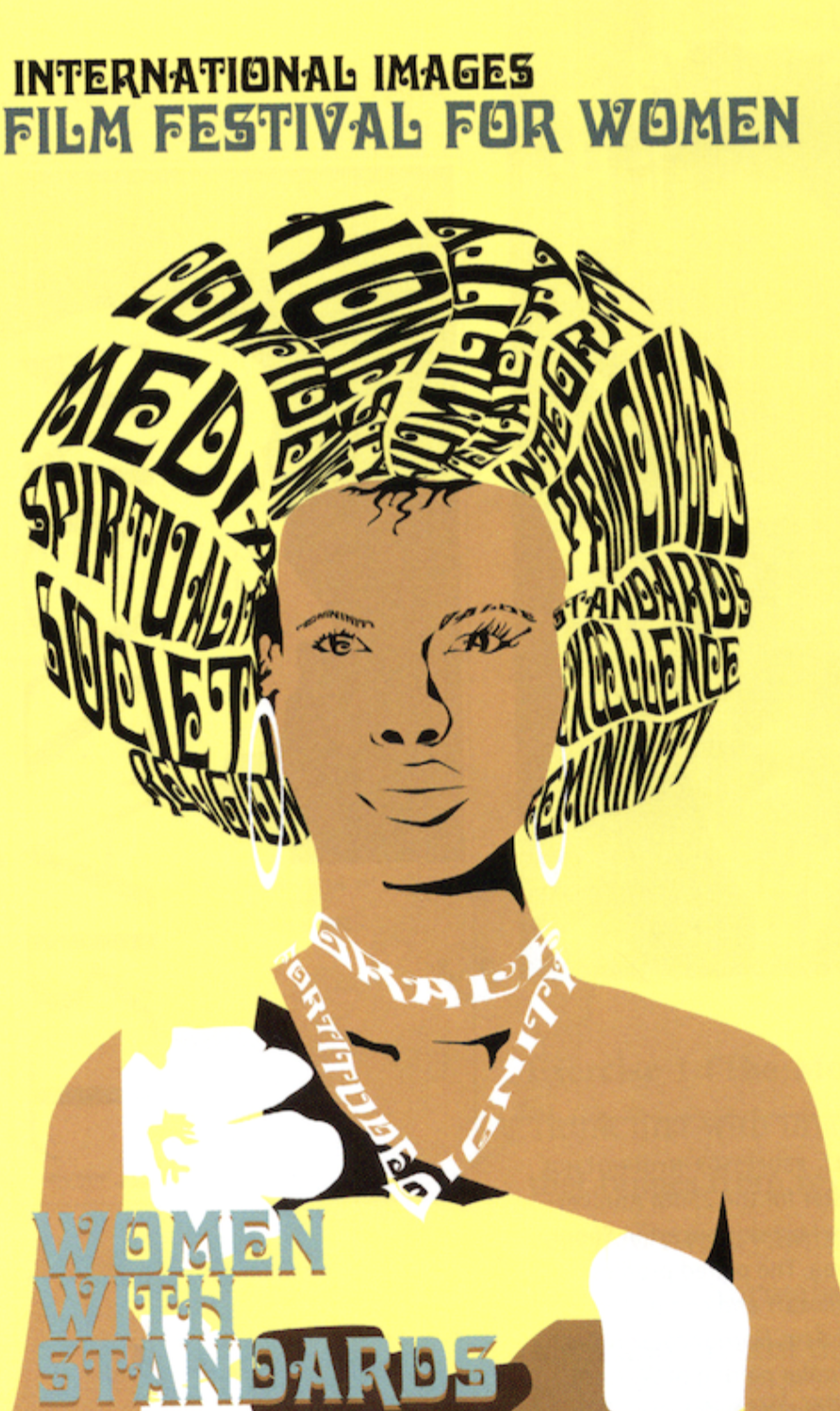
Photo via Guide to Graphic Design, Scott Santoro 2014
Designs also depend on the person designing them, and one’s own society and culture is important when developing ideas. An example of this is shown above, with hair serving as an important cultural element to the solution of the approach.